‹ Back

818GO

Direction on a project with no build budget
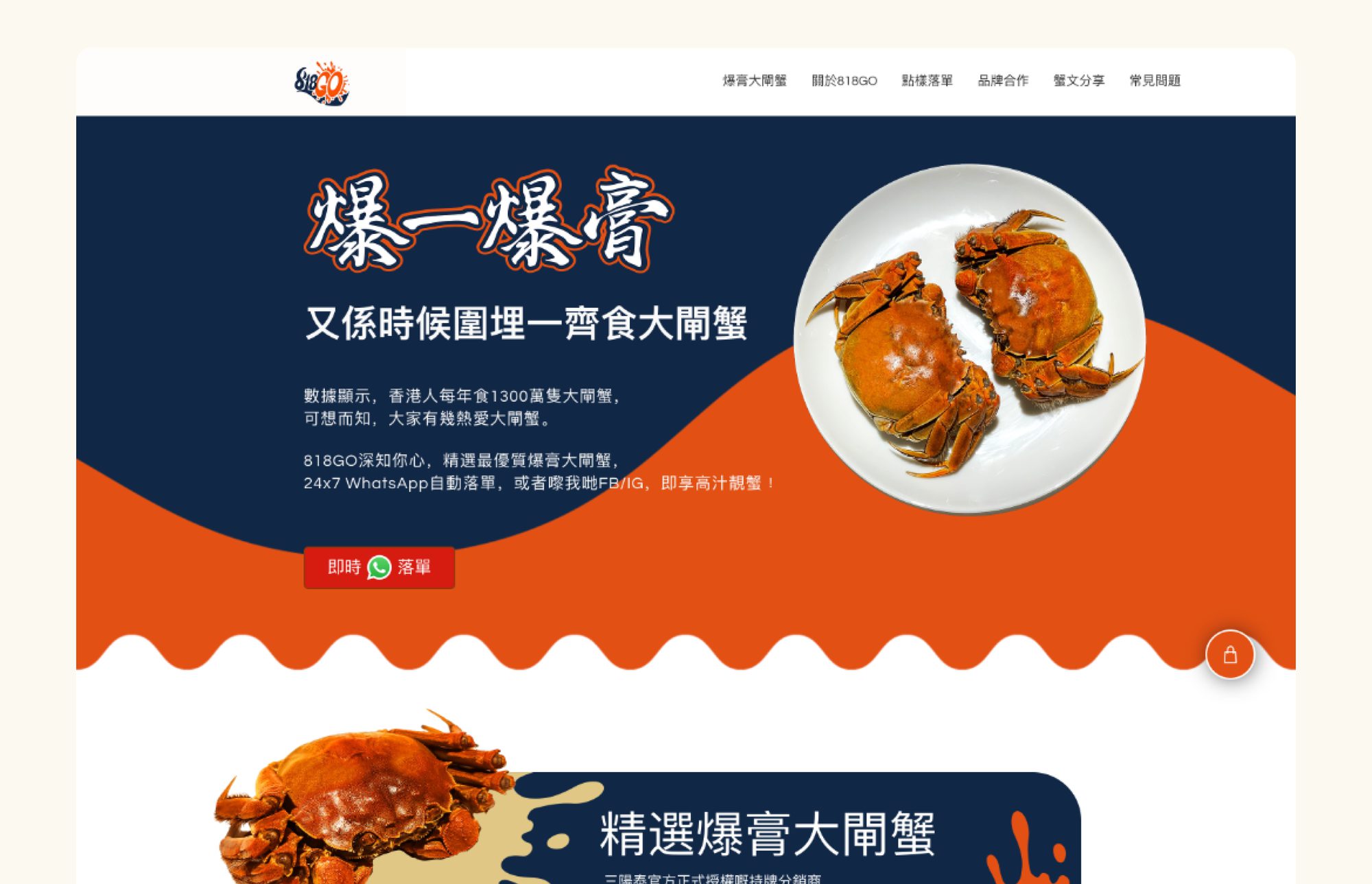
818GO landing page — 爆一爆膏, hairy crabs on dark blue and orange, with a WhatsApp order button

818Go sells hairy crabs to group buyers — a category where the visual conventions are fixed. Traditional brands use calligraphy, seals and heritage cues because that's what signals the real thing. 818Go was going after a younger, online-ordering audience, so I took the identity the other way: graffiti-derived marks referencing crab roe, and orange against dark blue instead of the usual red and gold. On a shelf of near-identical competitors, being immediately not-one-of-them does more work than being slightly better than them.
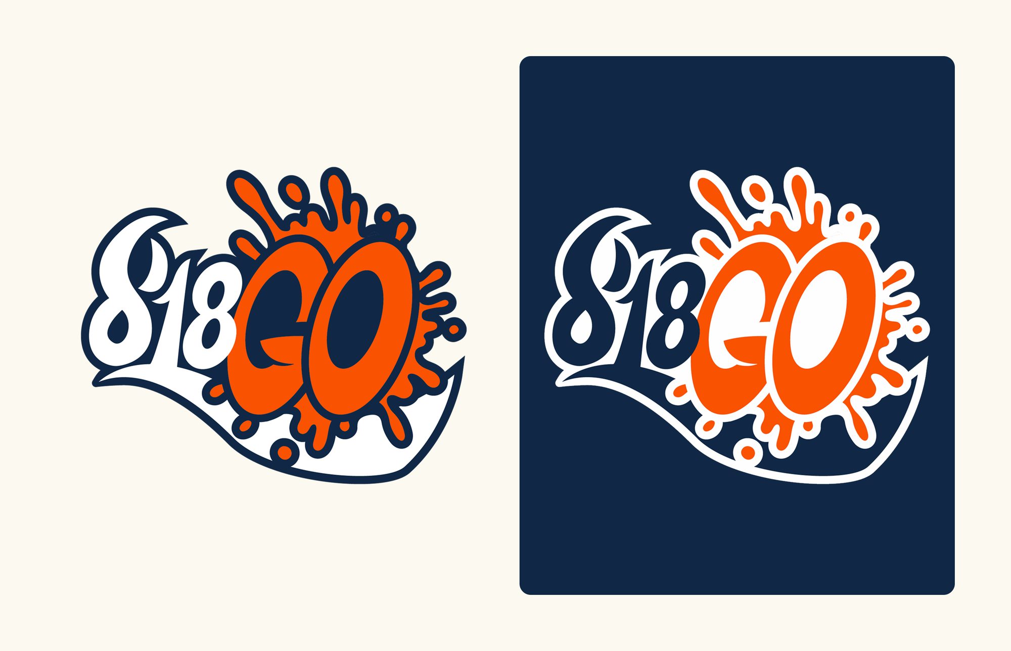
Fig. 01 / Artifact
818GO logo lockup — a graffiti-derived mark with a crab-roe splash, shown on cream and on dark blue
Graffiti-derived, orange on dark blue — built to not look like the category.

The budget only covered a Wix build, which decided how the work had to be split. With no room for custom front-end, whatever the site achieved had to come from art direction — photography, illustration and typography doing what engineering wasn't going to. I directed those pieces and supervised the designer building the site.
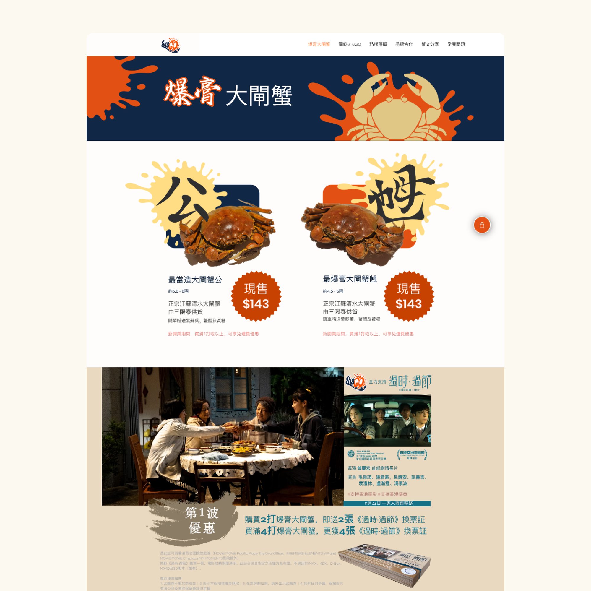
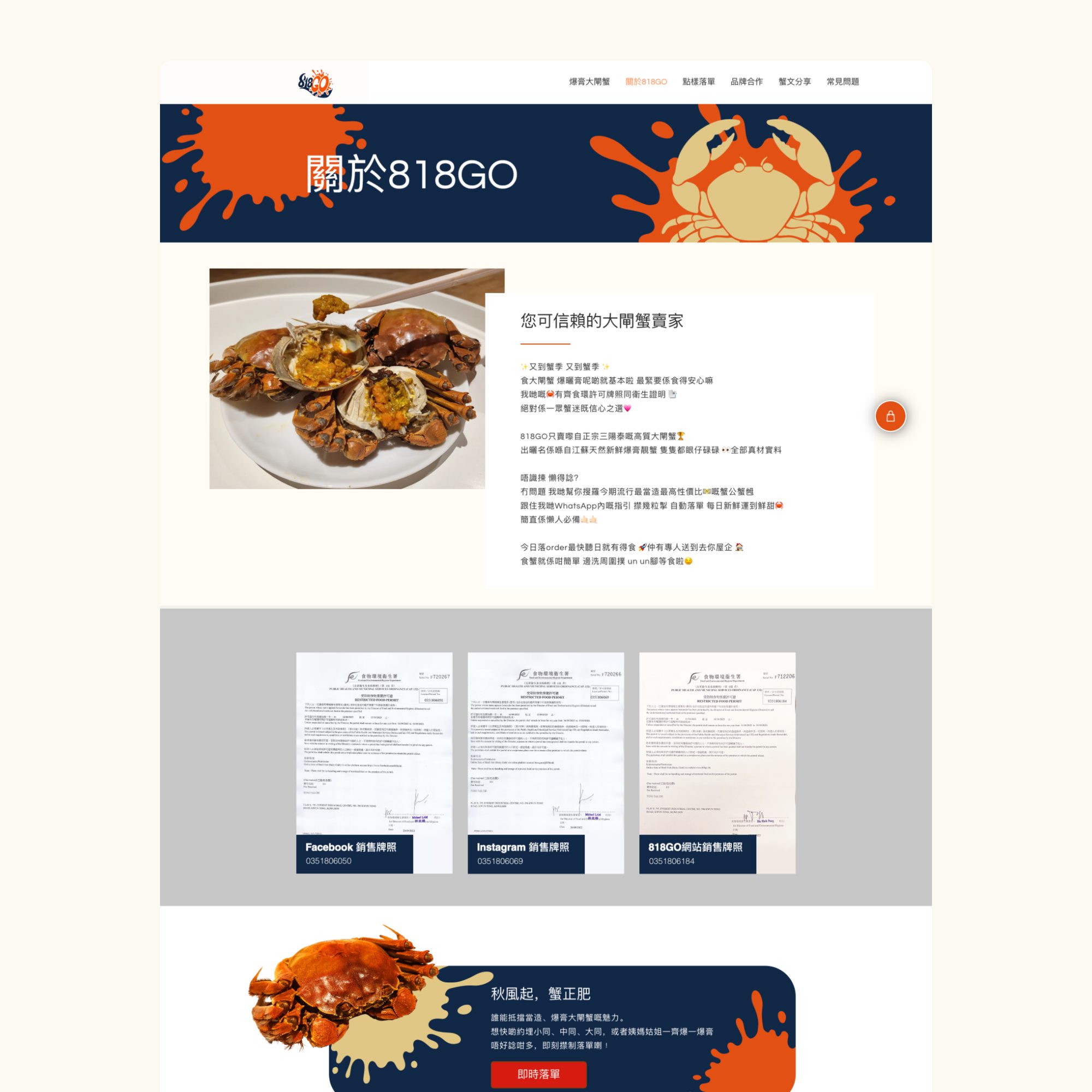
Fig. 02 / In situ
818GO product page — male and female crabs with pricing, splash graphics and a film-ticket promotion
Packaging and photography carried what the build couldn't.
Fig. 03 / In situ
818GO about page — the trusted-seller story, food licences and permits laid out as reassurance
On a template build, the reassurance came from content — sourcing, licences, tone — not features.
Fig. 04 / Illustration
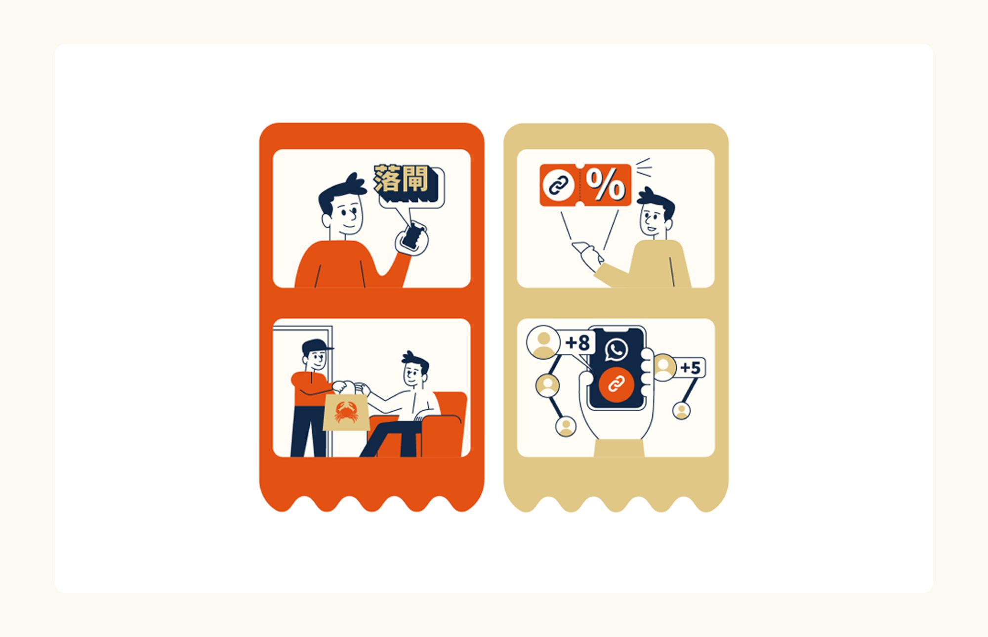
818GO ordering illustrations — placing an order, a coupon, a WhatsApp group buy and doorstep delivery
Ordering lived in WhatsApp, so illustration had to explain the flow the site didn't run.
Next project

HSBC Reward+

Illustration · UI · Motion

Mini games for an audience that doesn't play games

View project