HANG SENG BANK
Where a bank puts its offers, and what happens when you test it
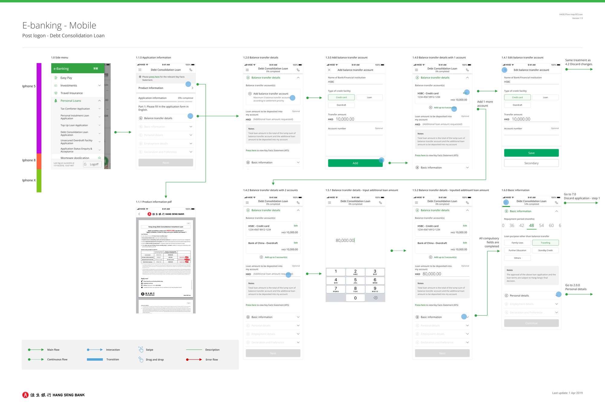
Hang Seng is one of Hong Kong's largest retail banks. I spent a year across cards, loans, securities and offers. Most conditions were fixed — the design system existed, compliance shaped the language, releases moved in quarters — so the year was about finding where judgement still applied. Most of it got resolved in flow maps rather than in screens: states, discard paths, error routes, dated and versioned.
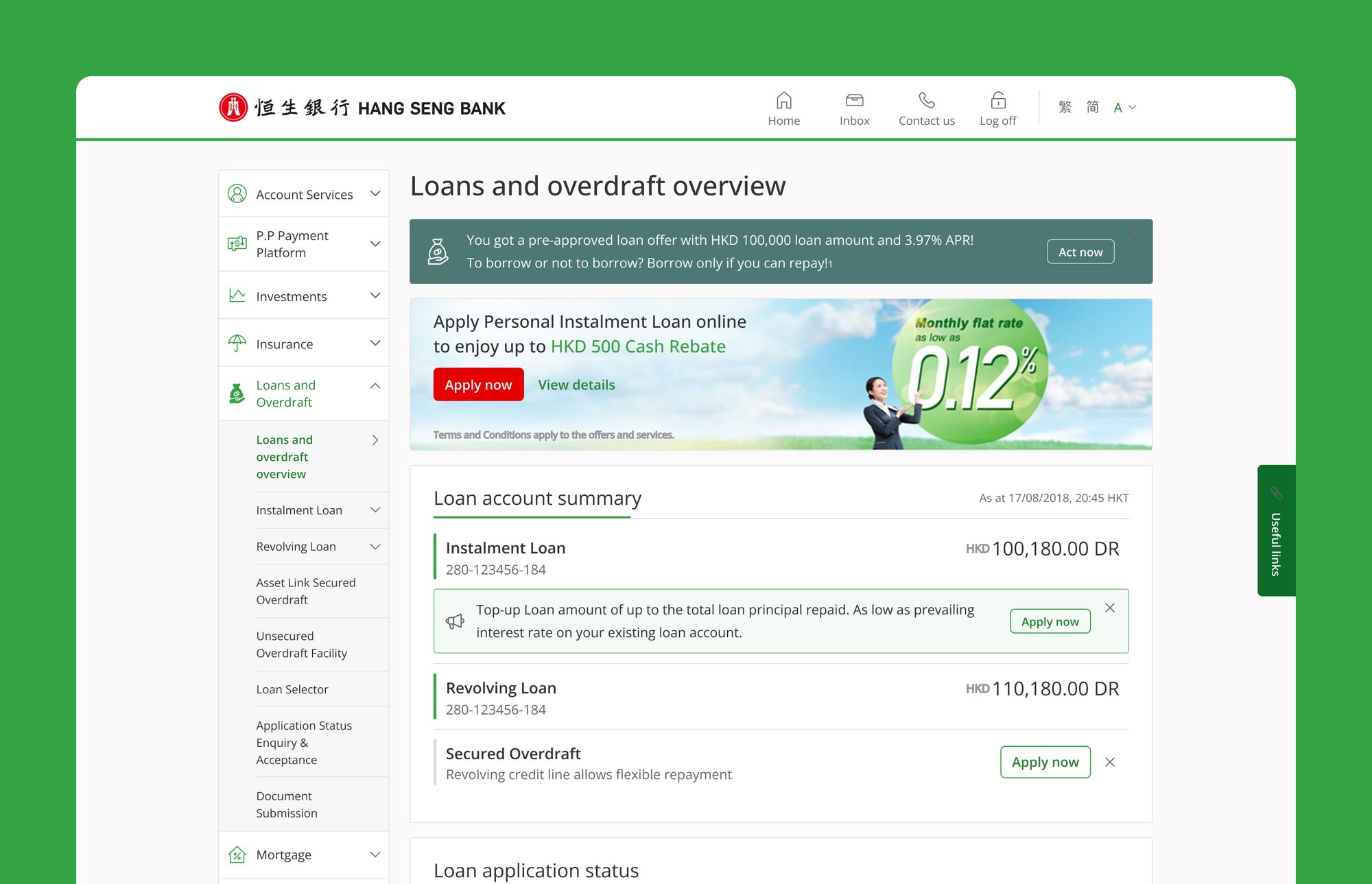
Loans and overdraft was the main contested surface. It is not one product — it is instalment loans, revolving loans, overdrafts, top-ups and tax loans, each with its own team and its own reason to appear. So the overview page accumulates entry points: a pre-approved offer at the top, a campaign banner under it, a top-up promotion sitting inside the account summary itself, a product the customer doesn't hold with an Apply button next to the ones they do. Each one is defensible alone. The screen is the sum.
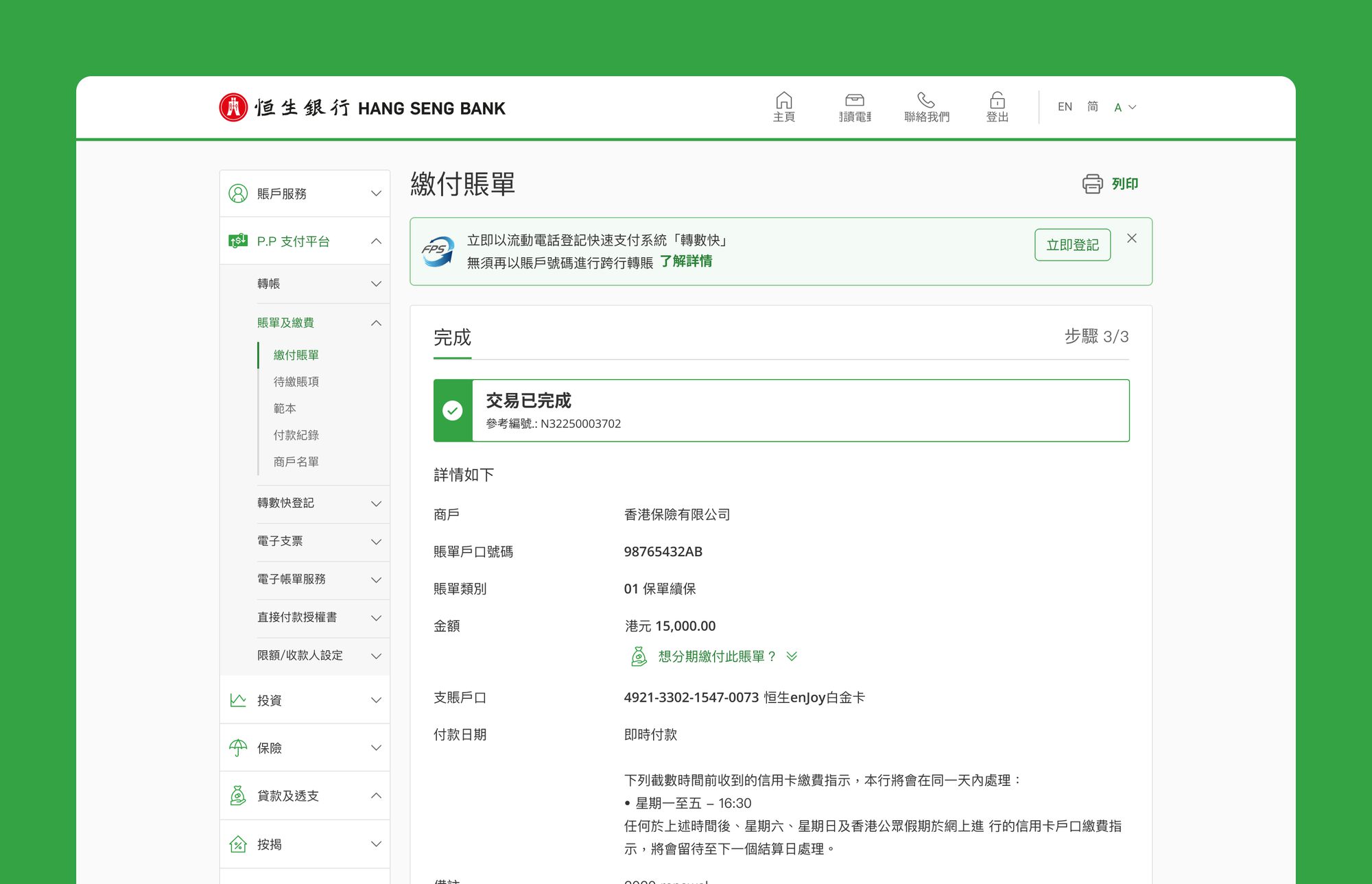
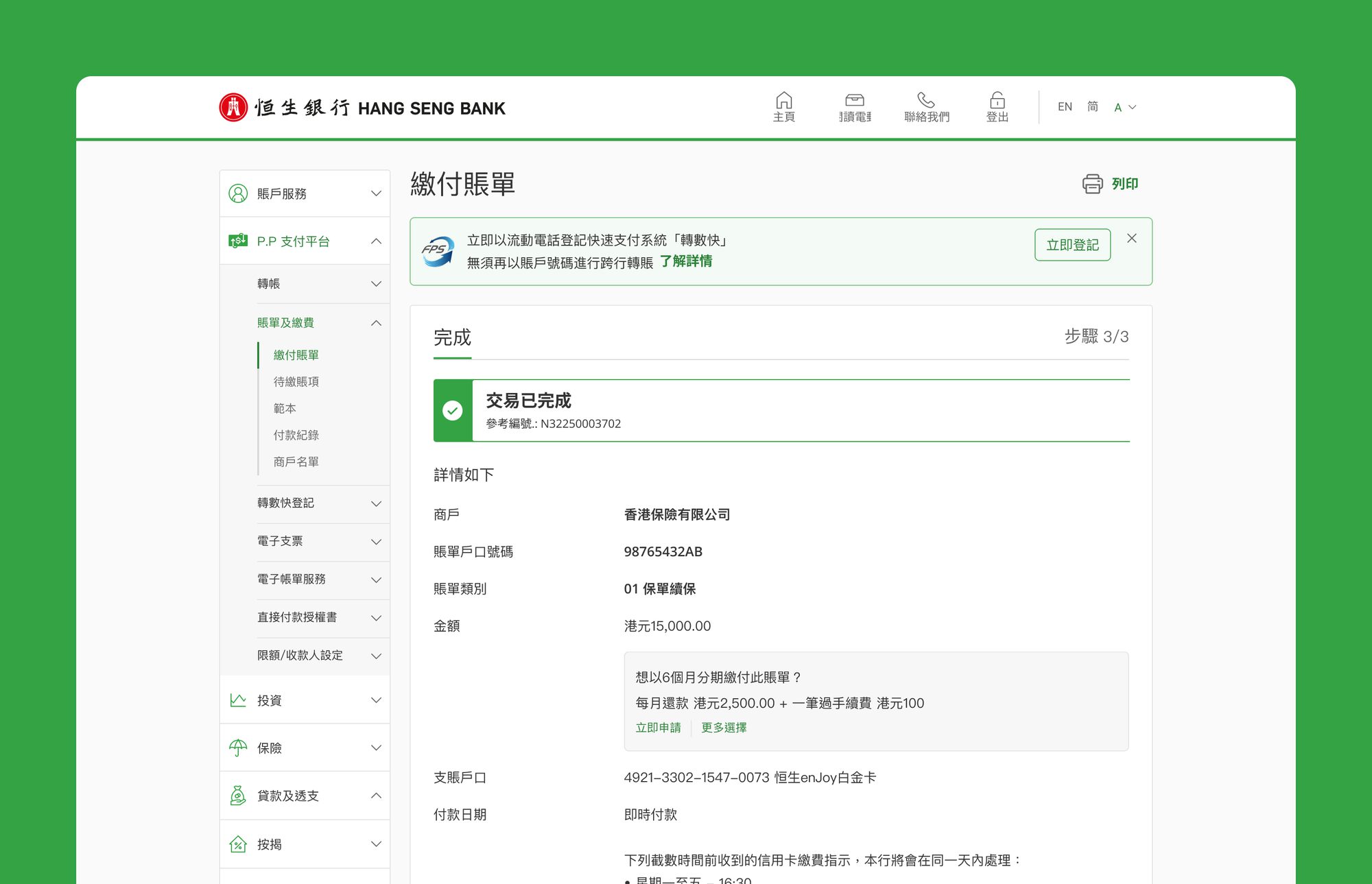
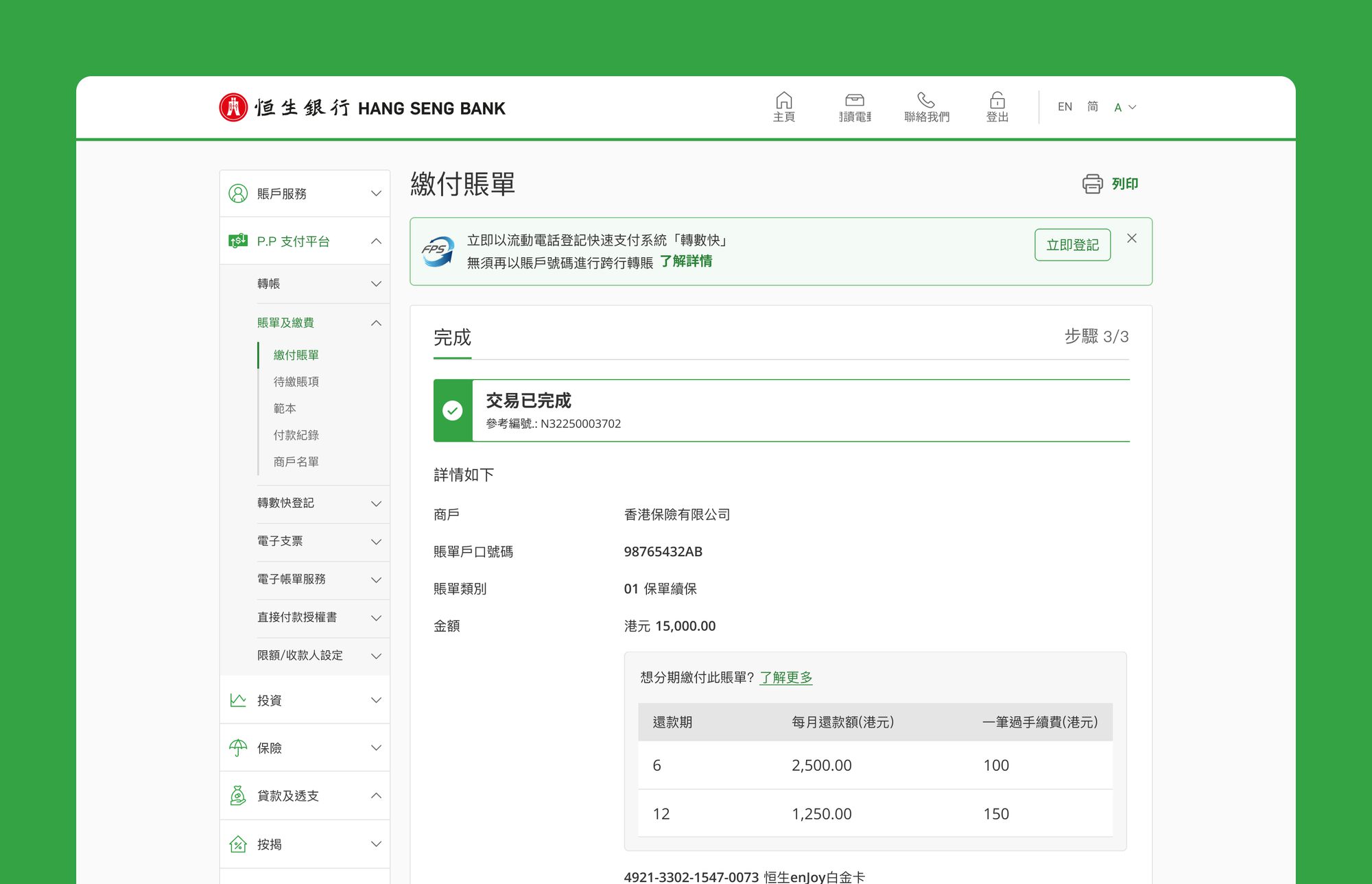
On one of these we tested rather than argued. Three versions of a bill payment acknowledgement went to users, differing on two things: where the instalment offer sits relative to the completed transaction, and how much of the cost it shows before the customer commits. Only the third version lets someone see that the longer plan costs more before tapping anything, which turned out to matter more than placement did.
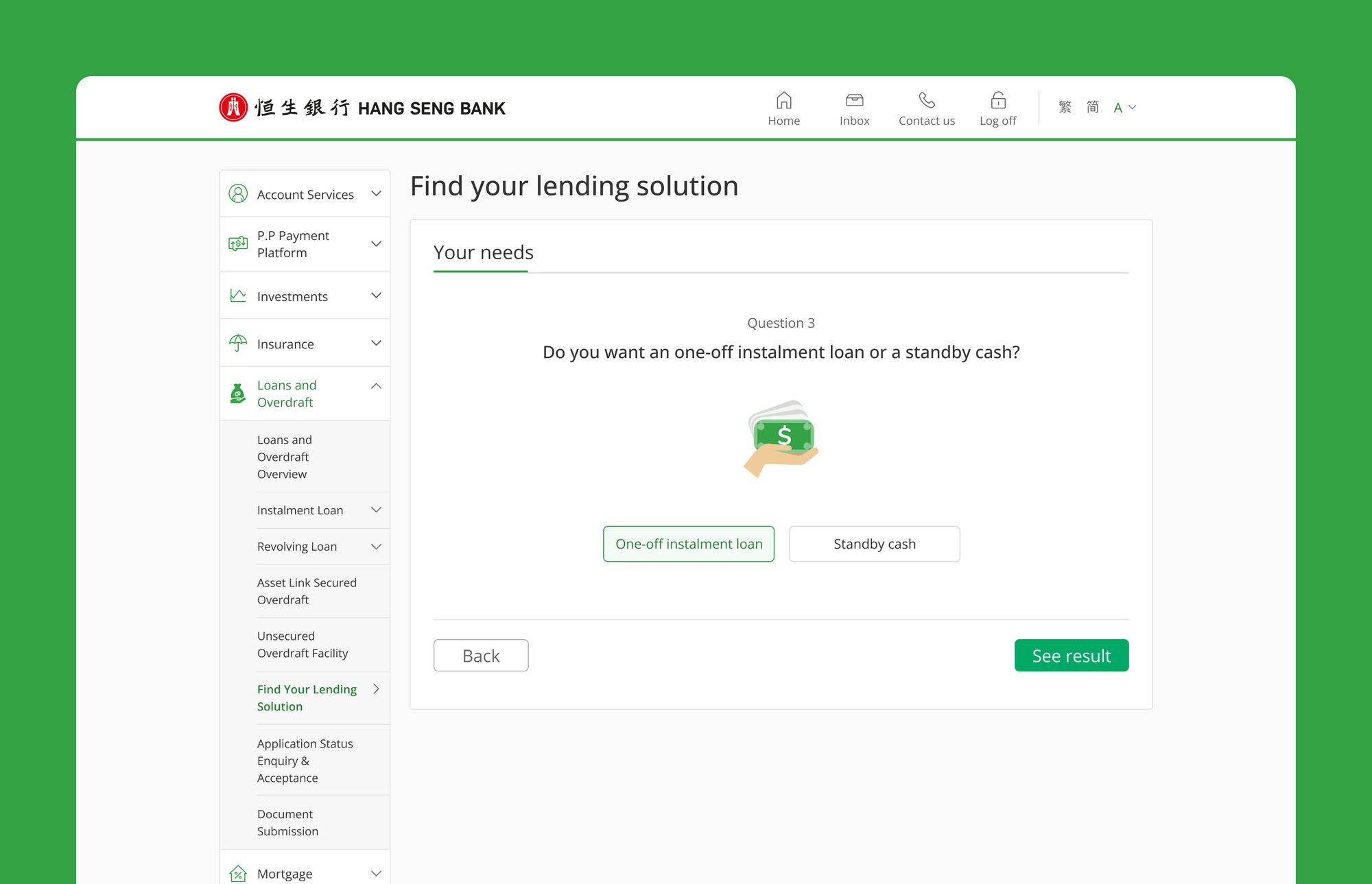
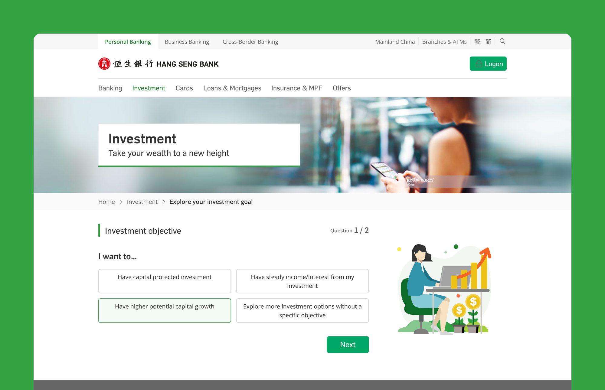
The selector work happened in two separate stretches. The first was for lending, inside the logged-in banking app; the second, years later, for investment on the public site. Both answered the same problem — a customer who knows their situation but not the product name — with a short guided sequence instead of a longer product page.
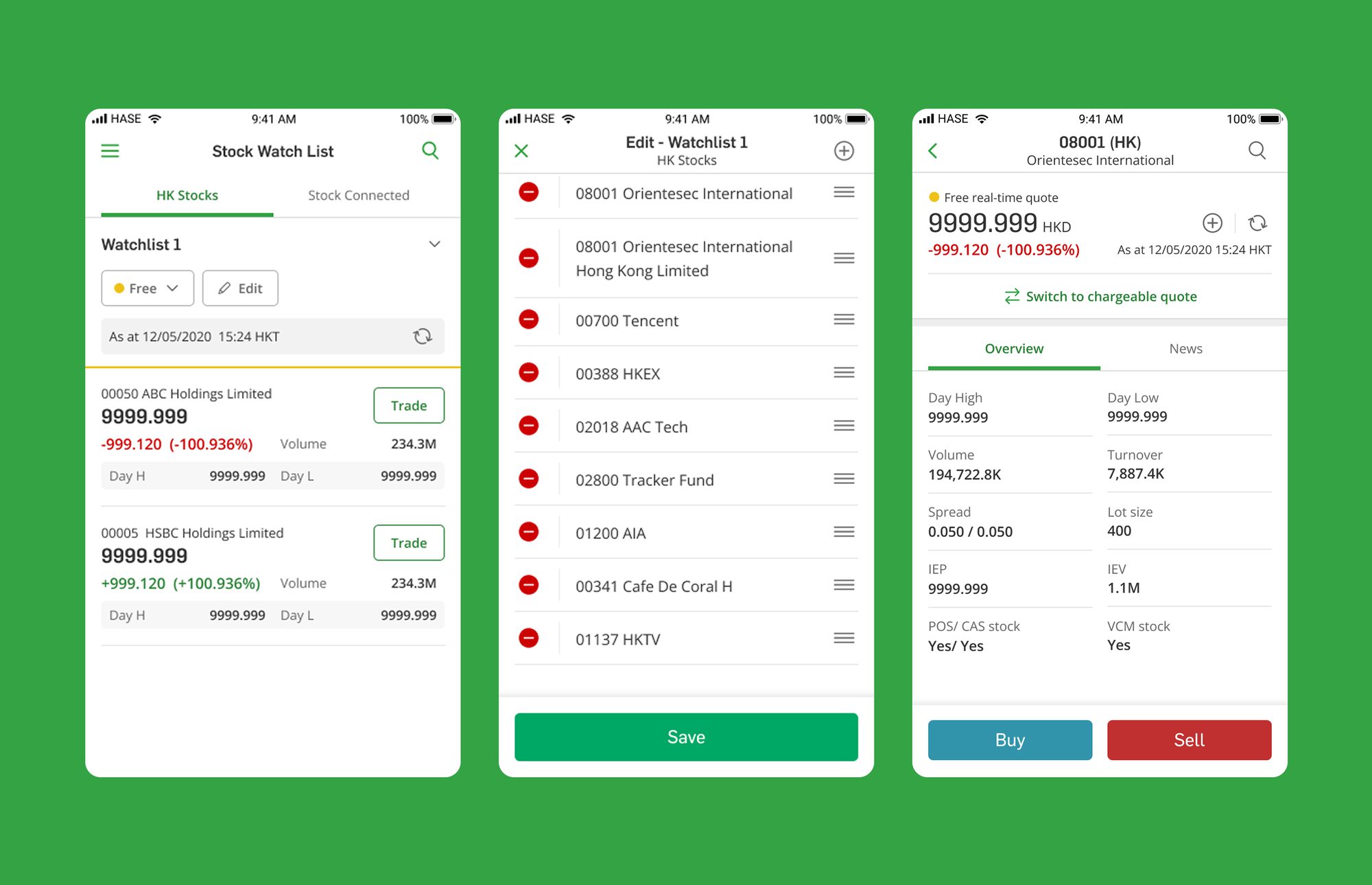
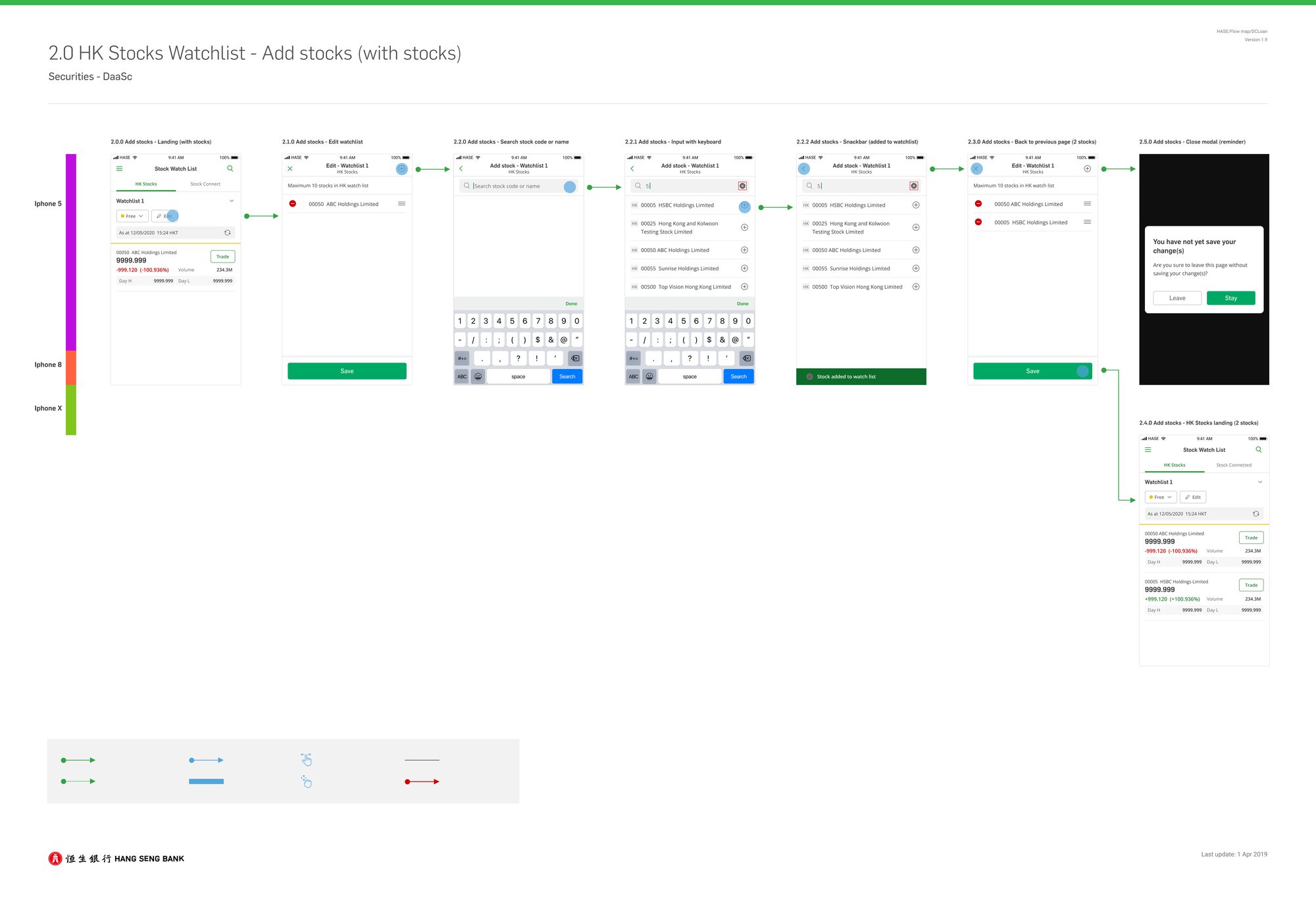
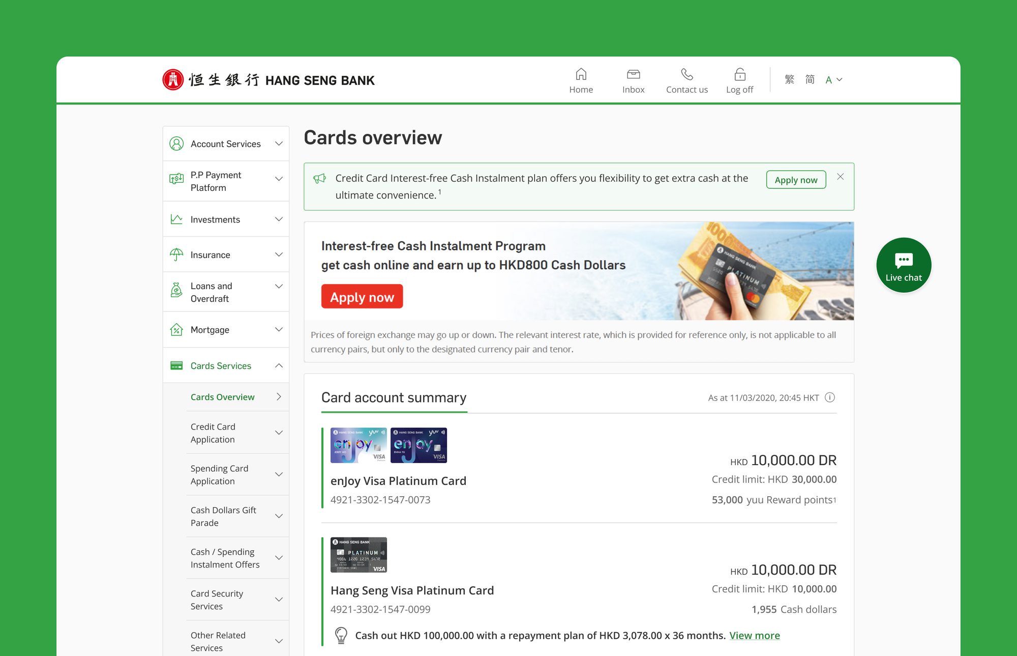
Securities was the opposite problem. Order types, settlement, quote entitlements and market-microstructure fields a retail customer has never heard of — the complexity is real, and taking it off the screen doesn't take it out of the decision. Cards had a milder version: one view carrying an account balance, a statement balance, a suspended due date and three separate reward currencies. Both had to be structured rather than reduced, which meant working with developers as much as with customers — interface states, customer-facing terminology and backend states had to describe one process.