VIRGO
Brand architecture for a company with one designer
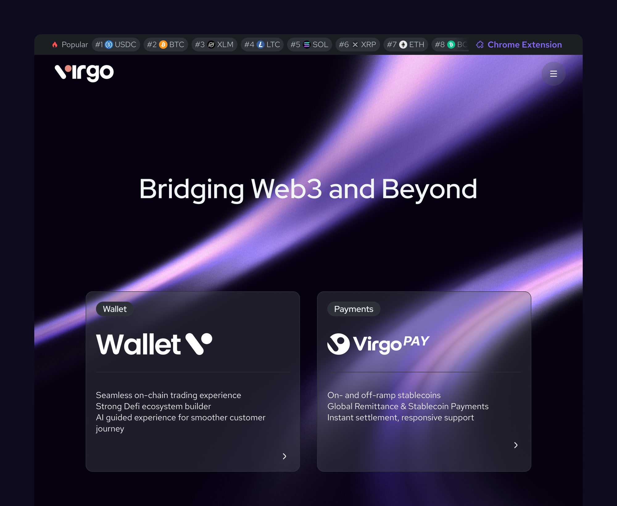
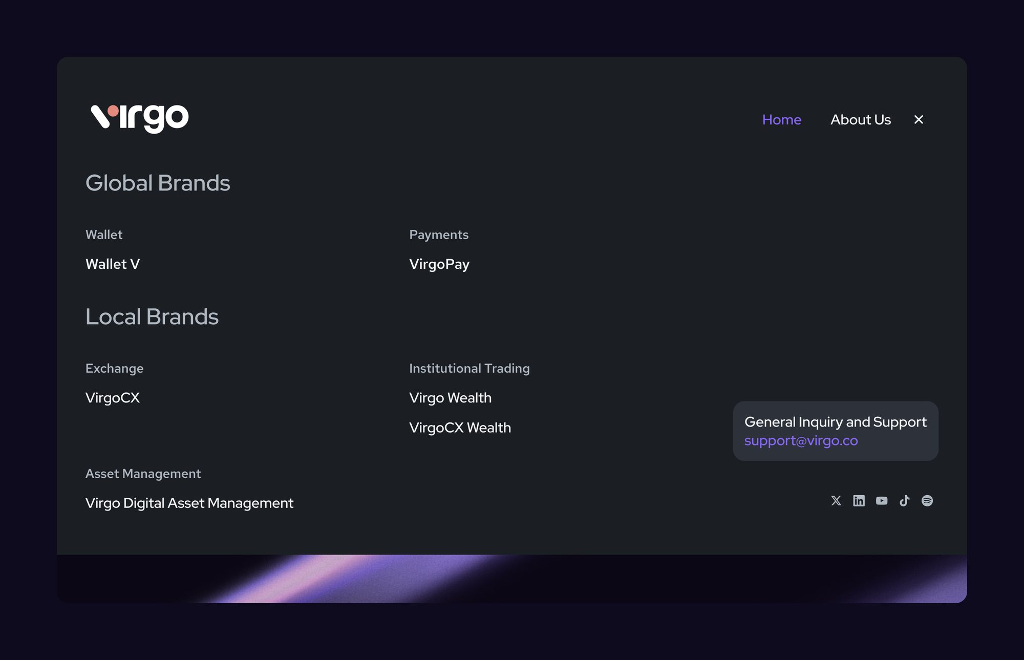
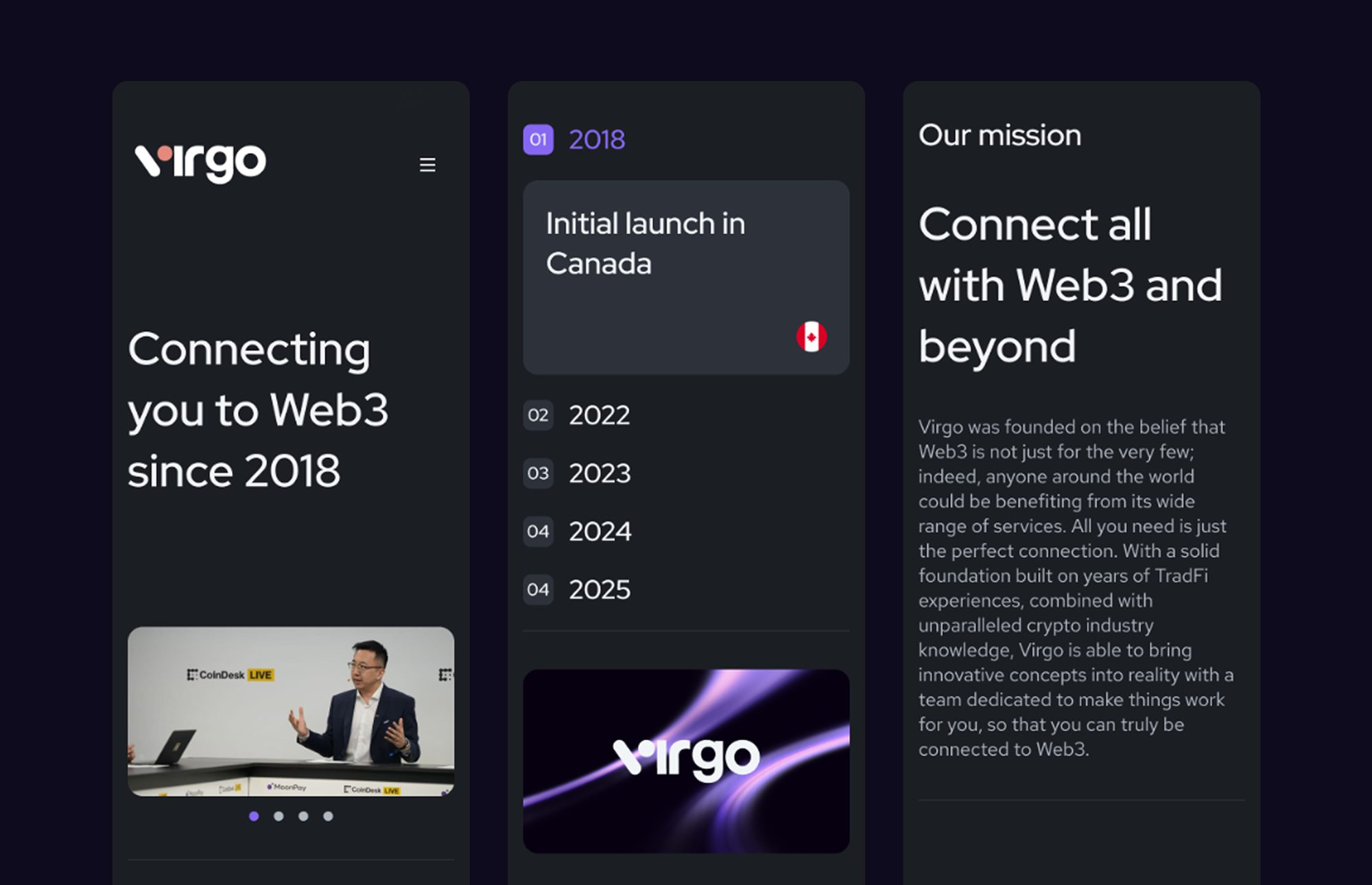
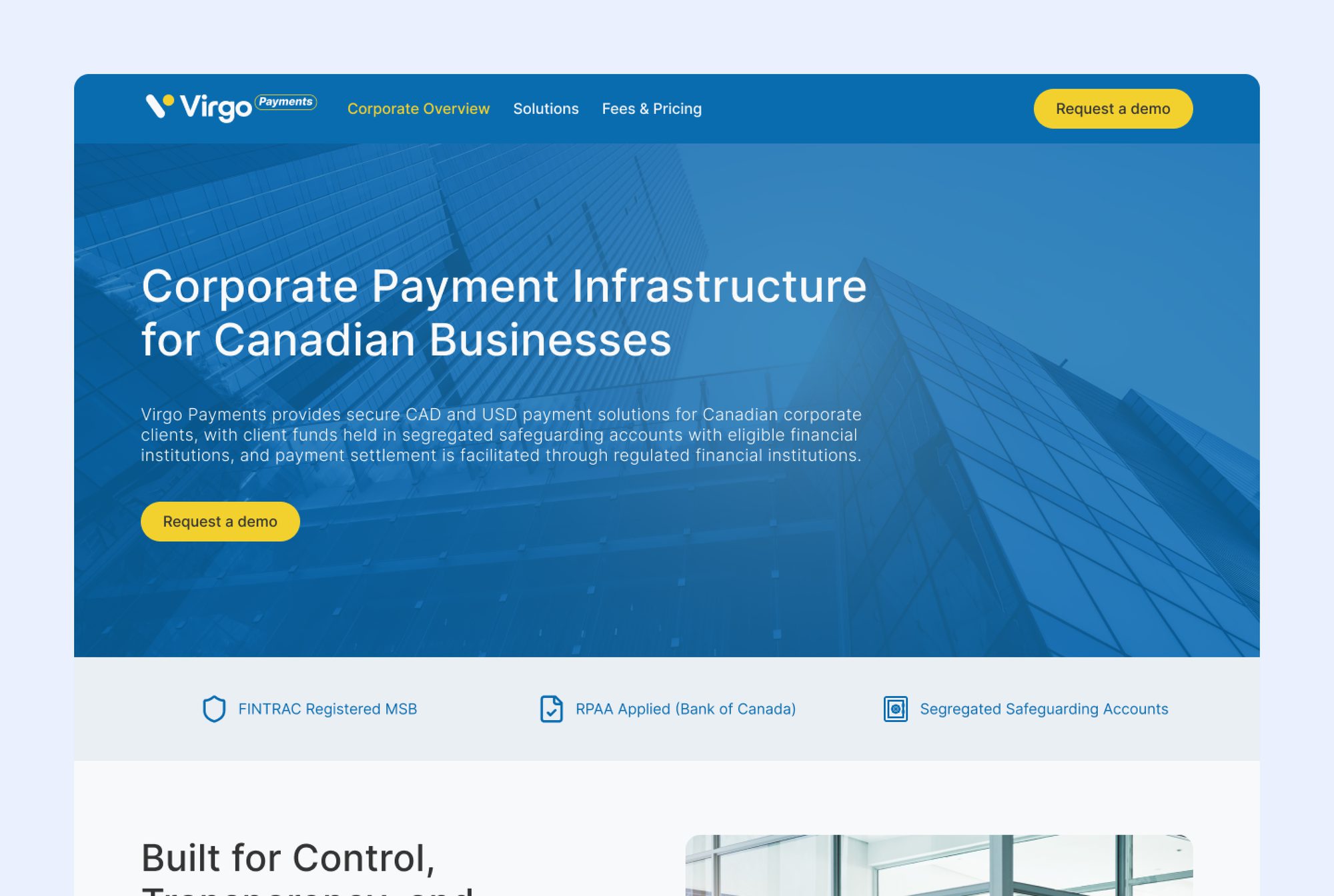
I joined as Virgo's only designer. The brand had been built for a retail crypto audience — the visual language of Web3 a decade ago — and the company it now belonged to was selling to corporate clients and institutional investors. The brief that followed wasn't a refresh. It was a repositioning that the design had to carry.
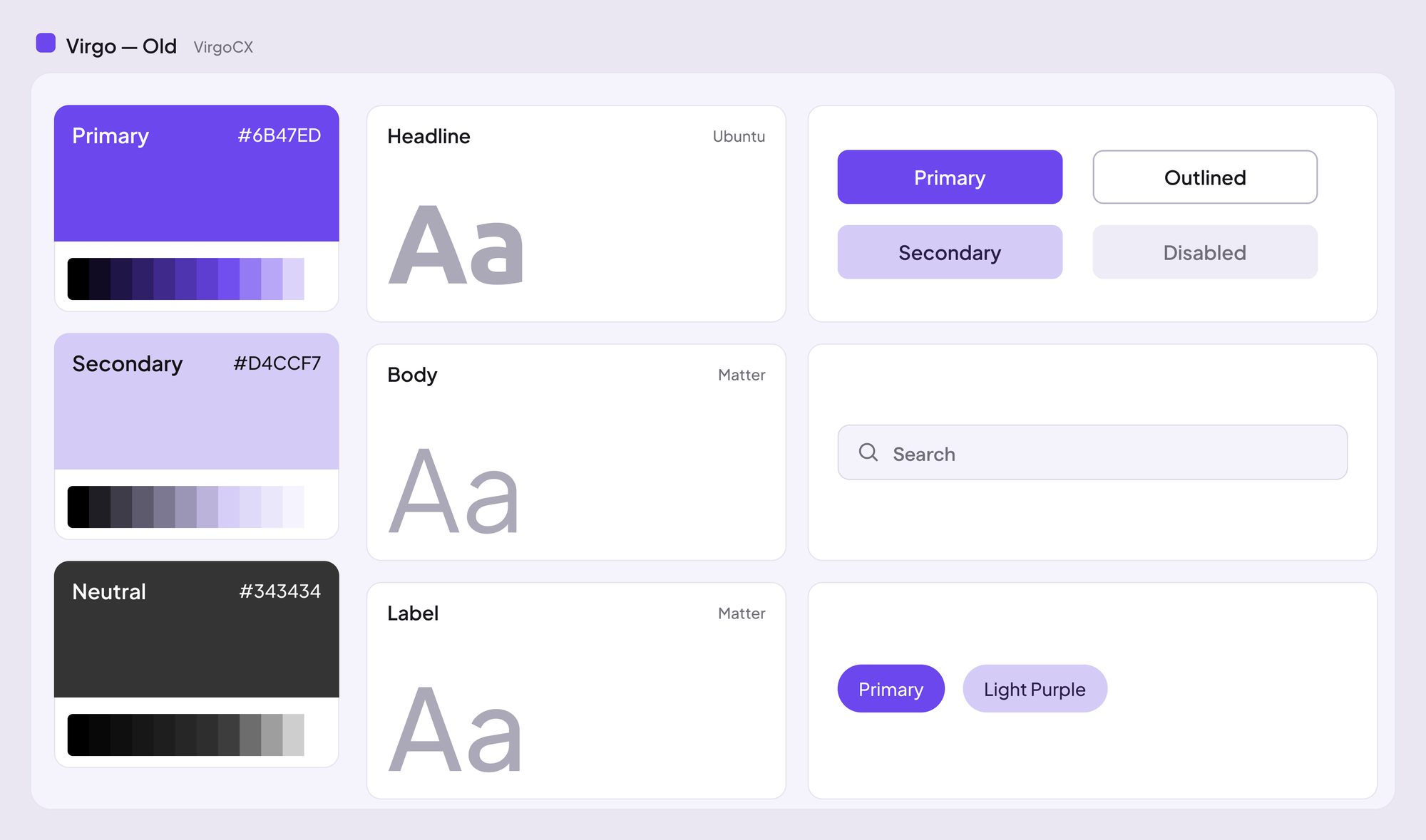
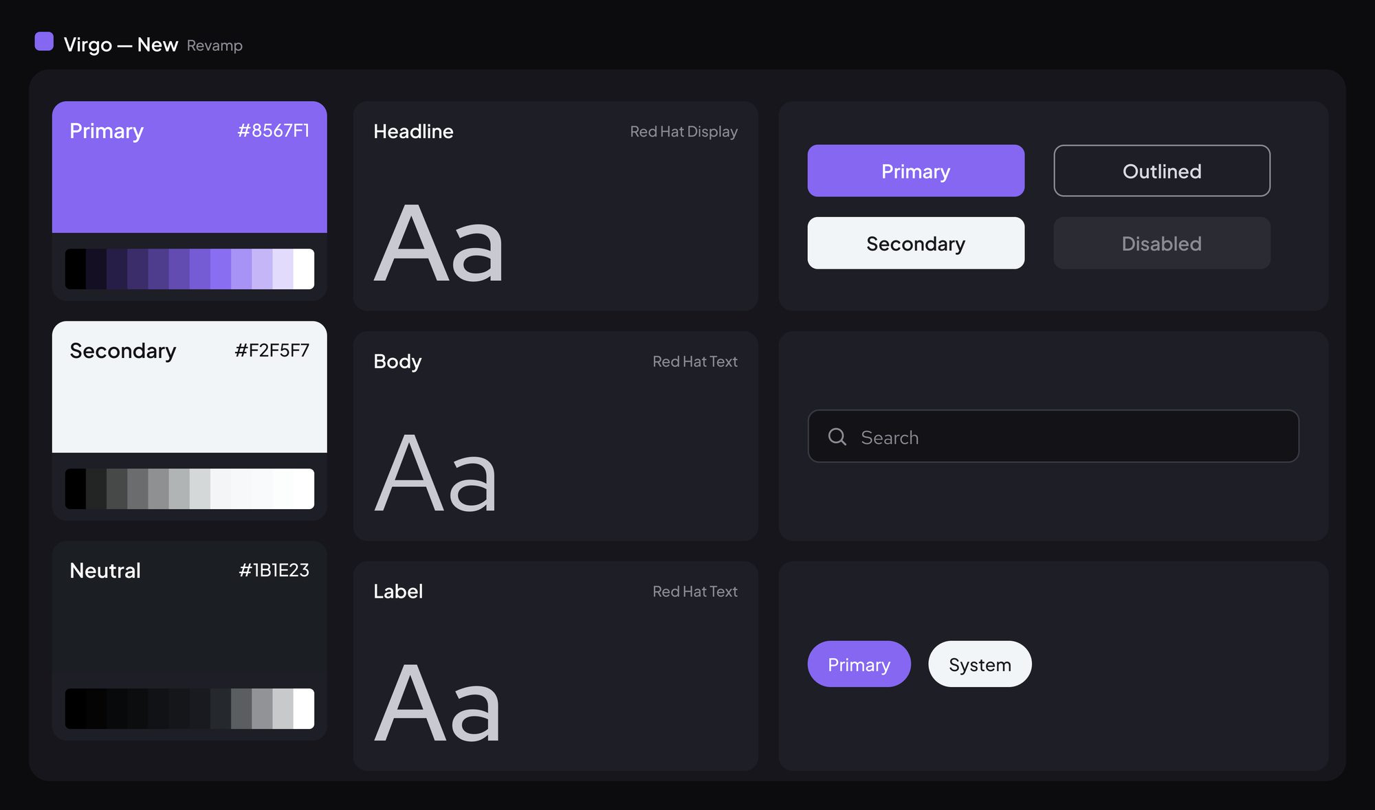
The rebrand moved the whole system toward restraint: plainer typography, less motion, a narrower palette, fewer gestures toward the category. Some of that reads as cold from the inside, and that reaction is the clearest evidence it worked. A finance team evaluating a payments provider is not looking for personality; they are looking for a company that will still exist next year and behaves like the institutions they already deal with. Warmth is a signal aimed at consumers, and consumers stopped being the audience.
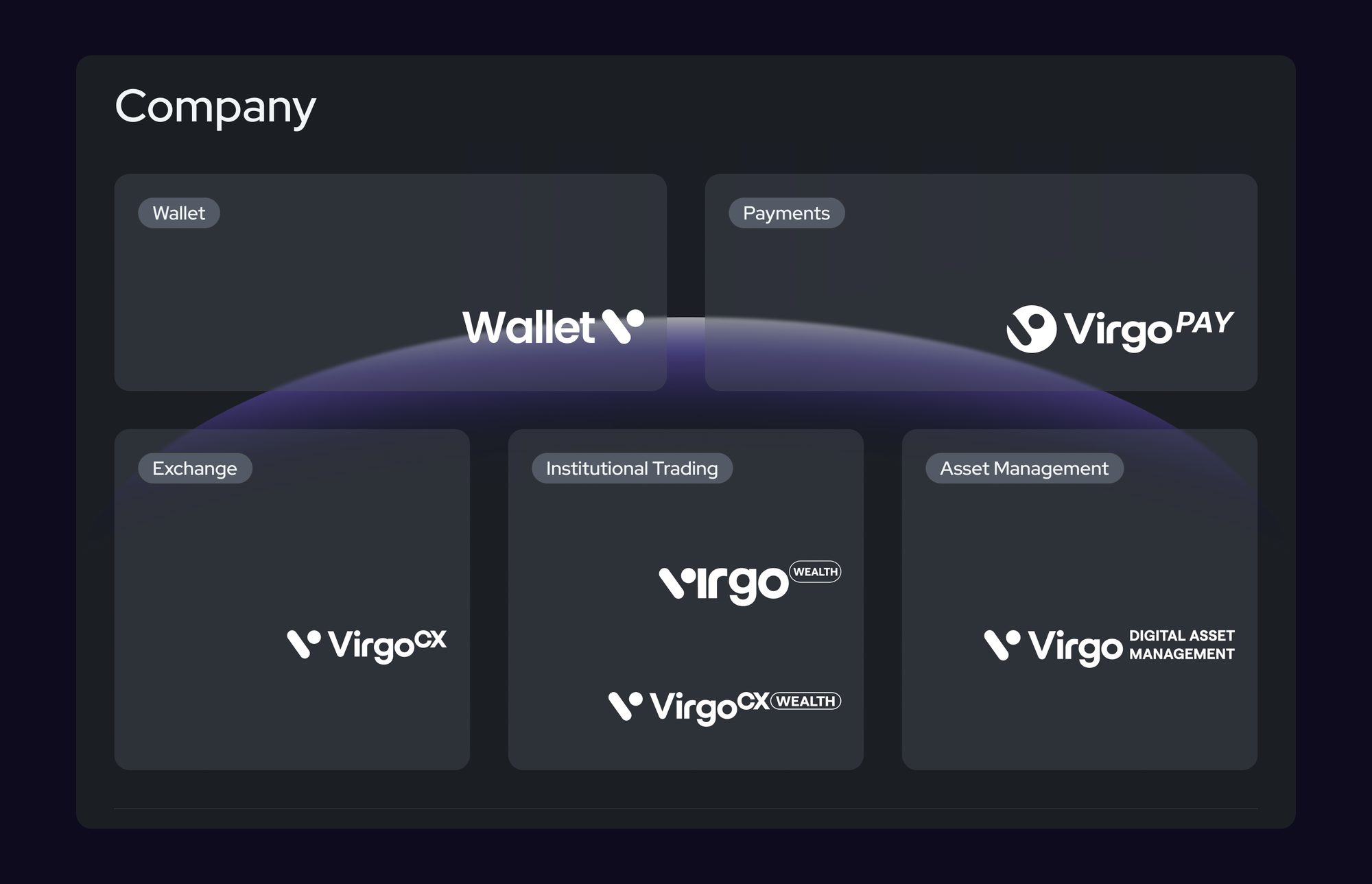
That new position was also what the sub-brands had to inherit. The company kept launching — payment products, a wallet, a business tier — and each needed to look like Virgo without looking like the same thing. I set the architecture as endorsed sub-brands: a shared parent signature, a fixed set of things each sub-brand may vary, and a fixed set it may not. The rules were the deliverable, not the logos. Logos would have covered the launches that already existed; rules cover the ones nobody had told me about yet.
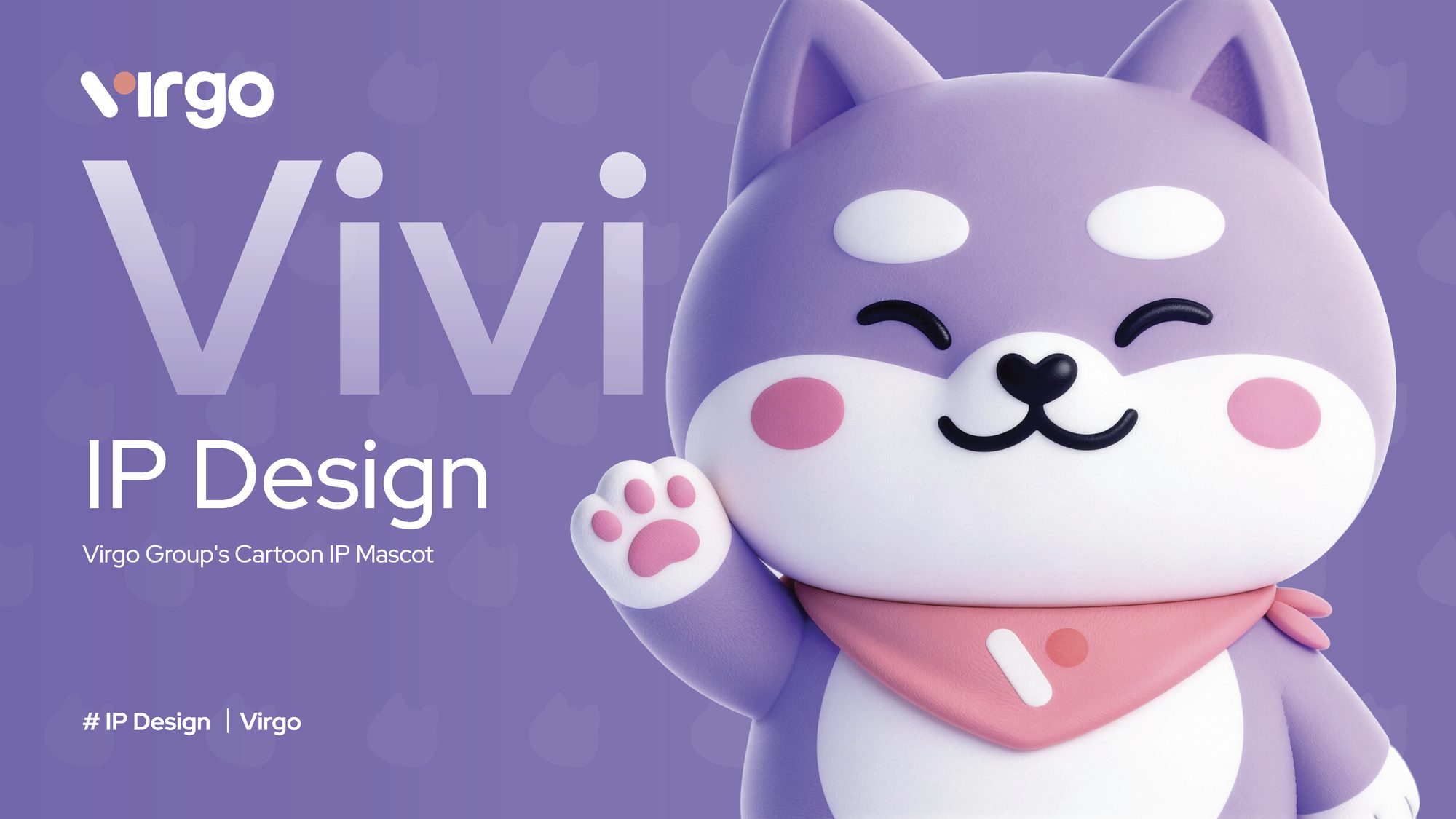
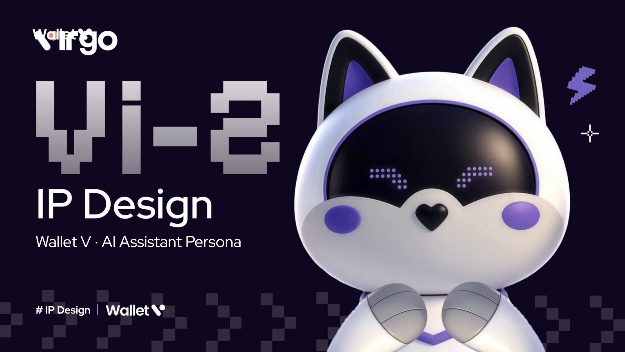
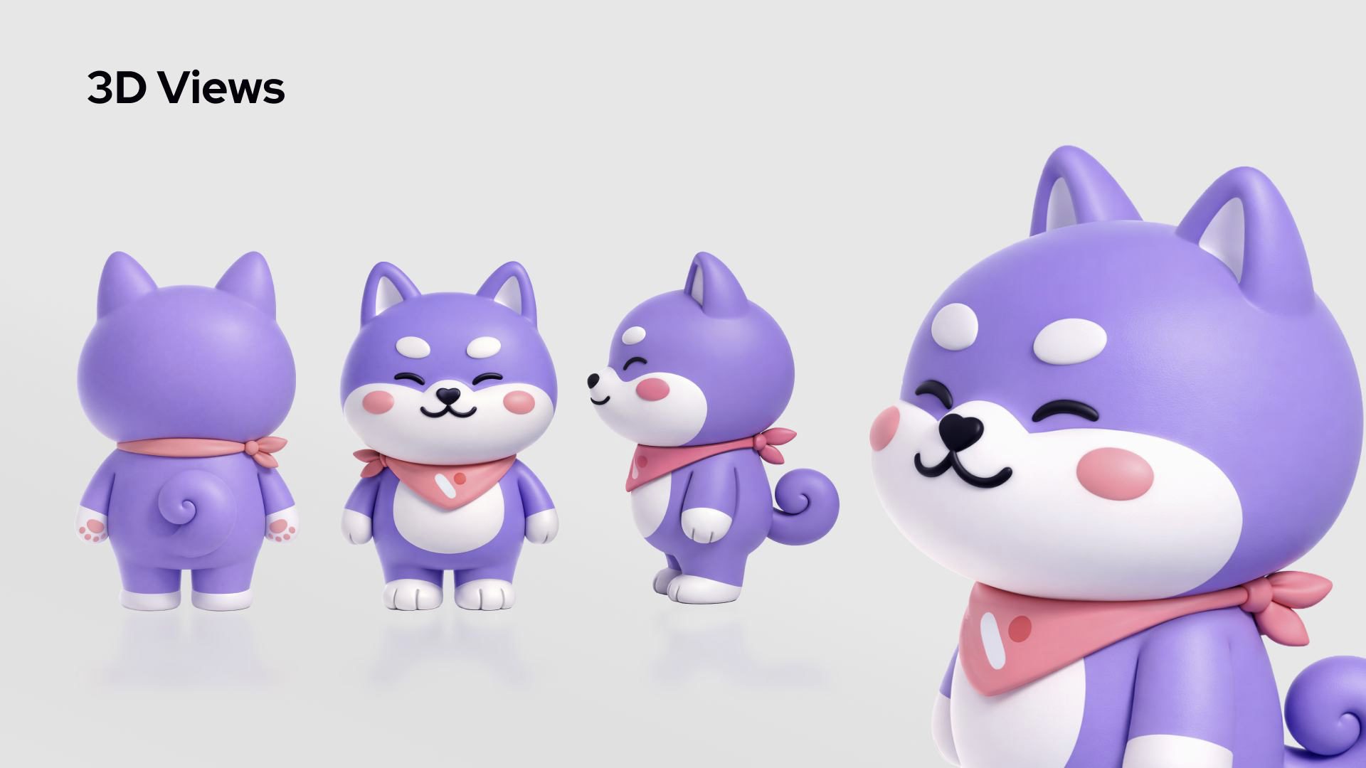
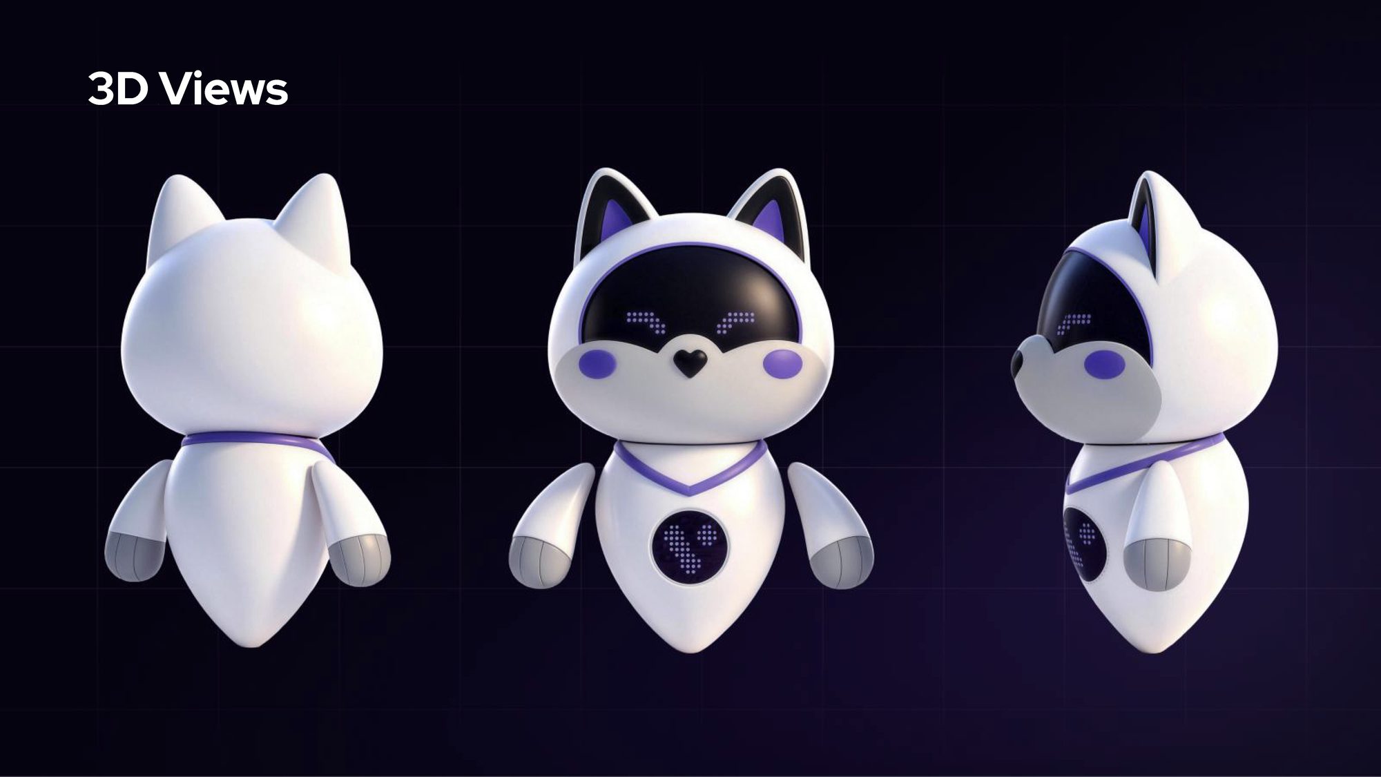
The mascot came out of the same need. A mascot gives a brand something a non-designer can actually use — hand someone a character and they will get more of it right than if you hand them a colour palette and a type scale. It also gave the brand an asset that belongs to us, which turned out to matter later.
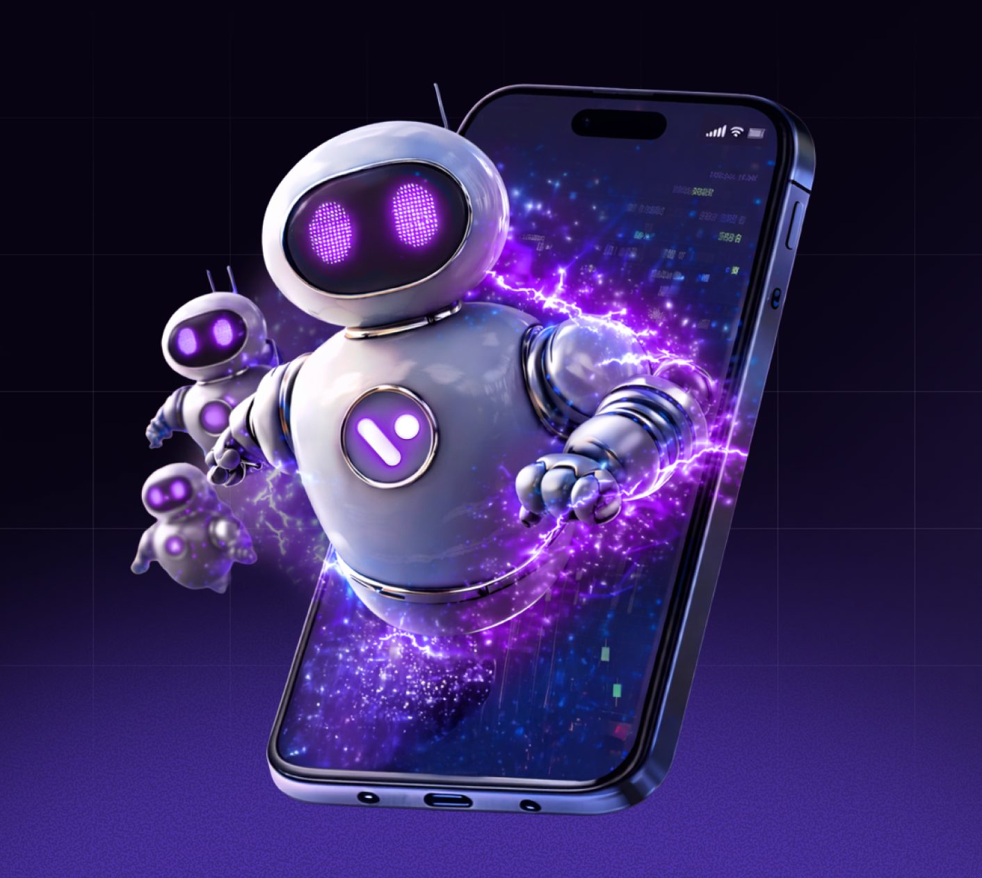
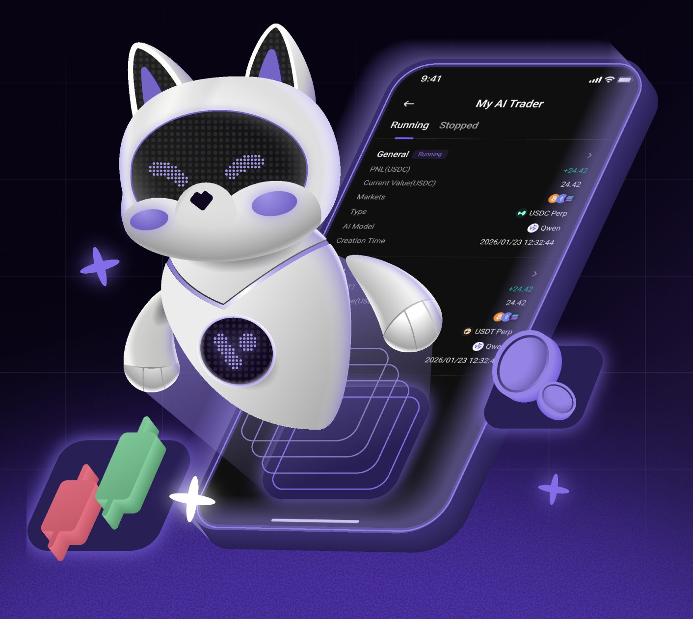
The real test wasn't design review. Other teams at Virgo ship with AI tools now, which means anyone can produce something that looks finished without a designer ever seeing it. So I wrote the brand documentation to be legible to that workflow — structured, explicit, and specific about what not to do — and made sure the people generating pages had it. The output moved closer to the brand, and generic stock characters were replaced by our own mascot. A brand system with no authority behind it is a strong suggestion; the work is making the suggestion easier to follow than to ignore.